|
Large Periodic Plots
George Snyder
– January 12, 2007
Plotting
a large data set in a compact format can reveal trends visually which
might be hard to detect algorithmically. The examples here show
ping
response time from several servers over a period of approximately two
years. Each pixel represents one minute, so each plot displays
about a million data points. A number of trends
are readily apparent, and subtler ones can be detected. They are
described in annotations on the plots.
Response times are classified as follows:
|

|
|
Fast |
0 - 10 ms
|
|

|
|
Good |
10 - 60 ms
|
|

|
|
Fair |
60 - 90 ms
|
|

|
|
Slow |
Over 90 ms
|
|

|
|
No Response |
The host was down or not
responding to pings, or the network was down
|
|

|
|
No Response |
The measuring host
(laptop) was off the network (very dark gray)
|
|

|
|
No Data |
The measuring host was
down or
was not taking data (black)
|
Recommendations for Viewing
The plots are wide; scroll them horizontally. Use View >
Full Screen (commonly
[F11]) in your browser to maximize viewing area. See
the bottom
of each page for annotation and zooming options. Zoom out (Fit
All) to compare long term trends on all servers over the full
two years. Zoom
in (100%) to see
shorter term trends and to read the annotations.
These plots emphasize
trends which occur at consistent times of the day.
Each plot is one day across,
approximately two years high. Each row of pixels is one
day (1440 minutes). Each hour of the day is a column 60 pixels
wide, and is marked with grid points. Each month is a row 31
pixels high, also marked with grid points.
These plots emphasize
trends which occur on consistent days of the week. They show the
same data, but
grouped into blocks of one day each. Each day has one row of
pixels per hour. The days are in columns of one week.
Machine Descriptions
Name
|
Location
|
Notes
|
Measuring Host (Badger)
|
Littleton, MA; later Andover, MA
|
A desktop PC running Windows
2000. "No Data" (black) areas are due to the
measuring host being down, in all known cases. |
Mail Server
|
Littleton, MA
|
Generally fast response, with long-term
degradations and improvements.
|
SMB Authorization Server
|
Fort Collins, CO
|
Generally fair response, with a period
of slow response.
|
Roseville Server
|
Roseville, CA
|
Generally slow response, with
occasional improvements.
|
Web Proxy Server
|
Atlanta, GA
|
Consistently good response, with short
scattered degradations.
|
Badger
|
MA
|
The desktop PC listed above, as
measured
from a laptop PC running Windows XP Pro. In this plot, "No
Response" is shown as dark gray rather than
red, because it usually means the laptop was disconnected from the
network. |
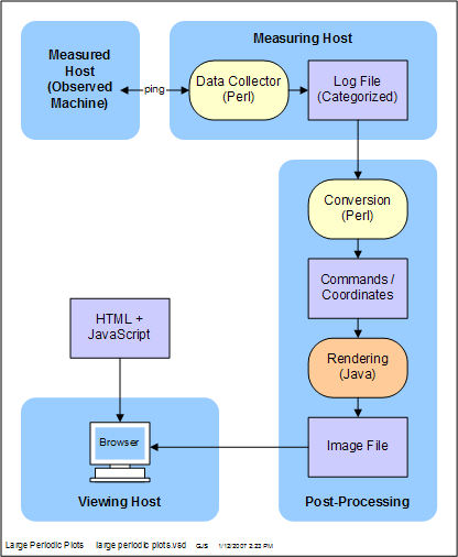
Plot Generation
The data was gathered by a continuously running Perl script for each
server. The plots were produced using Perl and Java. The
viewing pages use JavaScript.
|